Redesigned Book Cover: A Visual Representation of Love & Conflict
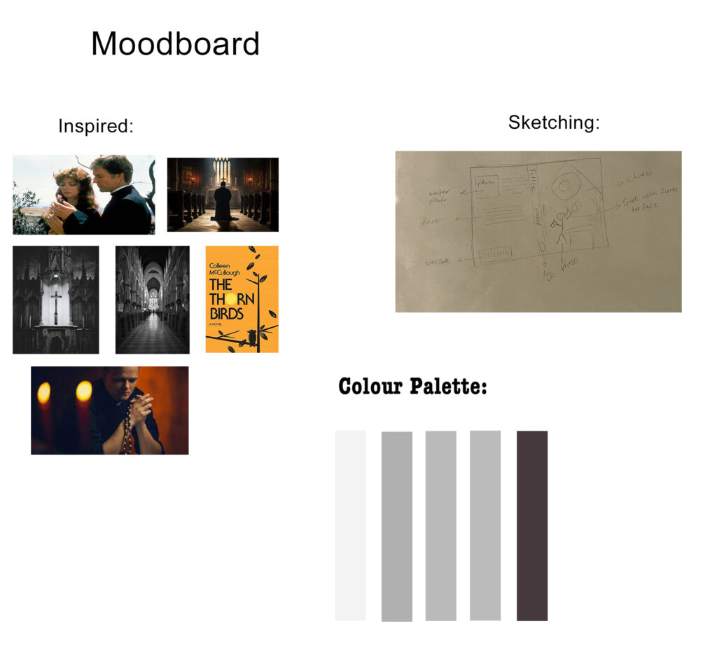
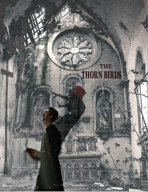
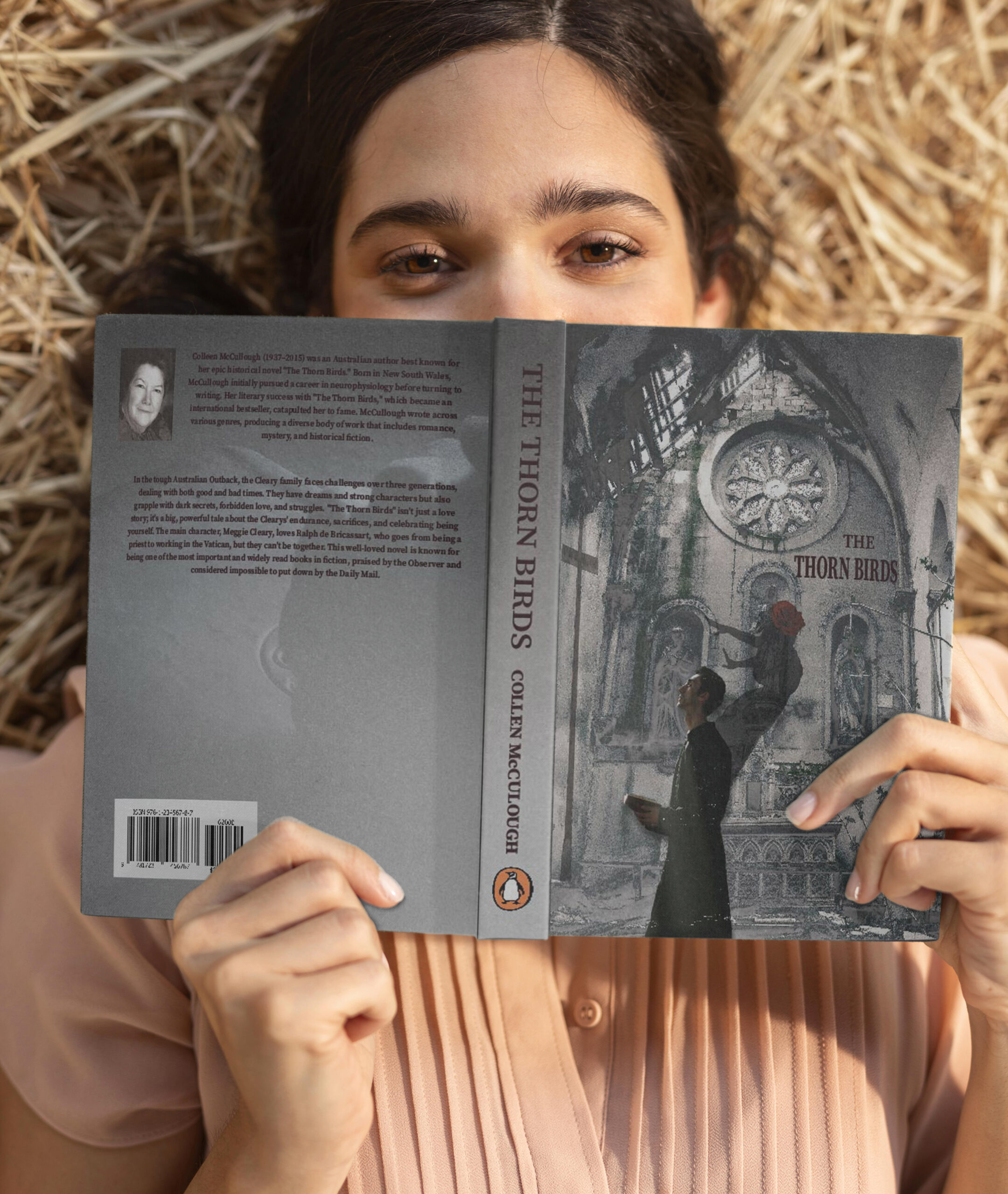
This redesigned book cover visually embodies the inner turmoil of a priest torn between his devotion to God and his forbidden love for a woman. Throughout the novel, this love remains inescapable, drawing him deeper into an emotional and spiritual struggle that challenges his faith.
To capture this complex dynamic, I carefully incorporated symbolic elements from the story:
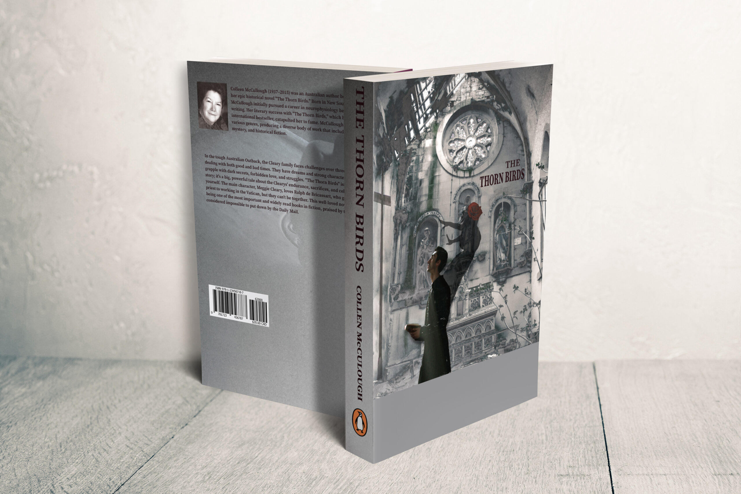
The Rose – A recurring symbol in the novel, representing passion, love, and longing, while also connecting to the farm setting where flowers play a significant role. In my design, the girl merges into the priest’s very being, symbolizing how deeply she is embedded in his soul, making her presence inescapable.
The Cross & Holy Book – The priest’s praying posture in front of the cross, with his hand resting on the holy book, reflects his intense internal conflict—a man of faith battling spiritual devotion vs. human desire.
Colour & Emotional Tone
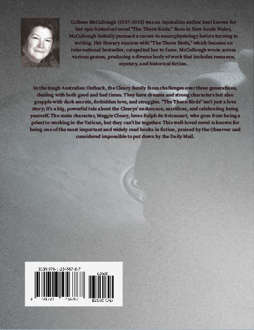
The gray colour palette was intentionally chosen to evoke melancholy and inner turmoil, reinforcing the emotional weight of the story. In contrast, the red rose acts as a visual focal point, symbolizing the intensity of love, pain, and sacrifice intertwined in the priest’s journe
Concept & Storytelling Through Design
This design captures the novel’s core themes of love, sacrifice, and internal struggle, presenting a visually haunting yet poetic representation of the priest’s battle between his heart and his faith. By carefully balancing religious symbolism, emotional depth, and striking contrasts, I aimed to create a cover that not only draws the viewer in but also stays true to the novel’s soul.
Clinique Fashion Booklet: A Minimal & Elegant Approach
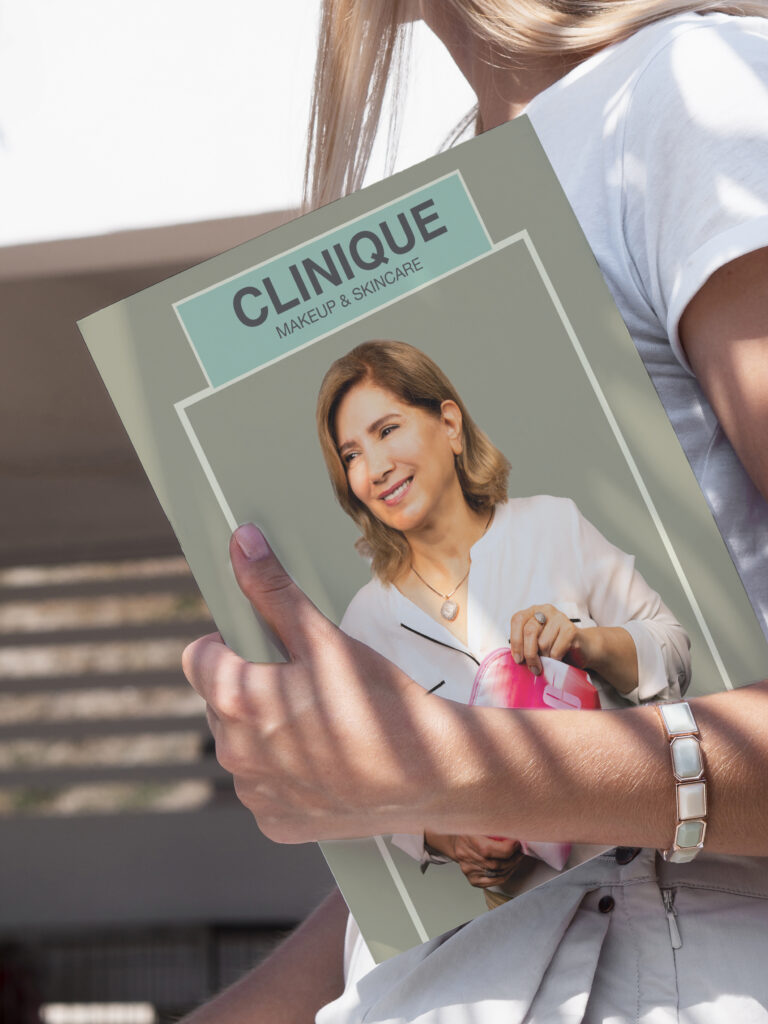
This fashion booklet focuses on the Clinique brand, with special attention to skincare products that are currently popular. The booklet features a minimalist design, using soft pink for highlights, headers, and select design elements. Light beige serves as the background color, while light green symbolizes freshness and skincare.
In the Seasonal Fashion Booklet (Research and Copy), I begin by providing a brief history of the Clinique brand. This offers readers new insights they may not have encountered before, encouraging them to engage more deeply with the products featured in the booklet. I also incorporate casual language to motivate readers and provide detailed information about the products and their uses. The project was executed in two distinct phases, ensuring a seamless blend between photography and design to maintain brand consistency and aesthetic appeal.


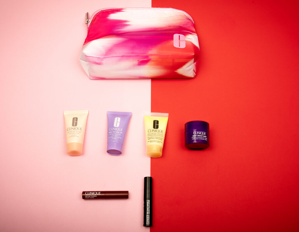
Phase 1: Photography – Capturing Elegance & Simplicity
The first step was crafting a studio-based product and model photography session, emphasizing soft, natural lighting to create a warm and inviting atmosphere. My approach was minimalist, allowing Clinique’s products and models to take center stage without distractions.
Lighting & Mood: Soft, diffused lighting was used to enhance the products’ natural textures and reflect Clinique’s fresh and clean brand identity.
Composition: A simple and minimal shooting style ensured the visuals remained elegant, refined, and cohesive with the brand’s aesthetic.
Phase 2: Editorial Design – Translating Visuals into Print
Once the photography phase was completed, I moved into designing the fashion booklet, ensuring that the layout and typography complemented the minimalist elegance of Clinique’s branding.
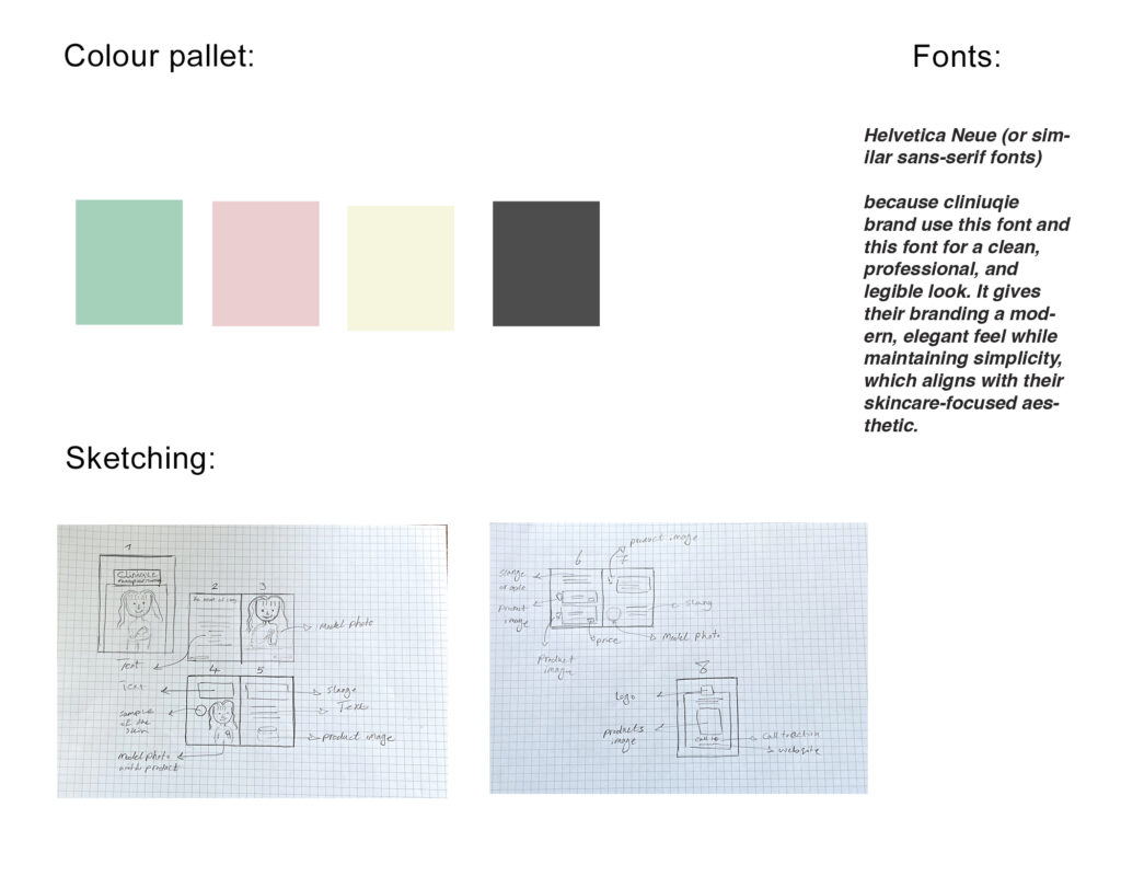
Colour Palette: I carefully selected Clinique’s signature pastel shades—cream, green, pink, and gray—to reinforce brand consistency and evoke a sense of freshness and sophistication.
Typography: To maintain visual harmony, I chose a font that closely resembles Clinique’s iconic branding, ensuring it remained modern, minimal, and highly legible.
Layout & Aesthetic: The overall design follows a clean, editorial approach, ensuring that both the photography and textual elements work together seamlessly, creating a visually immersive experience for the audience.
Final Impact & Brand Alignment
This Clinique fashion booklet successfully translates the brand’s identity into a tangible, high-end editorial piece, reflecting both elegance and simplicity. By carefully curating photography, design, and typography, I ensured that the final product is aesthetic, professional, and aligned with Clinique’s visual storytelling.
Brochure created March 25, 2024
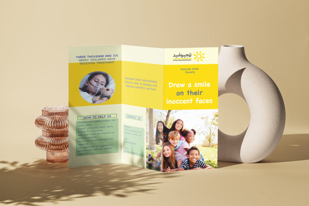


Zanjireh Omid (Chain of Hope) Charity Brochure Design
Zanjireh Omid is an international charity based in France, operating under the name Chain of Hope in many countries. The organization is dedicated to providing lifesaving medical care for children under 18 years old who suffer from heart and orthopedic diseases. Through its global network of doctors, hospitals, and donors, Zanjireh Omid ensures that children in need receive the specialized surgeries and treatments required for a healthier future.
Design Concept & Color Choice
For this brochure, I carefully selected a color scheme that reflects hope, warmth, and positivity—the core values of Zanjireh Omid’s mission. The main color, yellow, comes from the organization’s logo, symbolizing the sun, energy, and optimism. To complement this, I used light green, which represents hope, renewal, and healing, as well as gray and white to maintain a clean and professional look.
Balancing Emotion & Positivity
While the brochure includes images of sick children, I was intentional in ensuring that the overall tone does not focus solely on pain or suffering. Instead, the design highlights hope and transformation, showcasing the positive impact of Zanjireh Omid’s work. The main slogan, “Draw a smile on their innocent faces,” reinforces this message—shifting the focus toward the joy and relief these children experience after receiving treatment.